
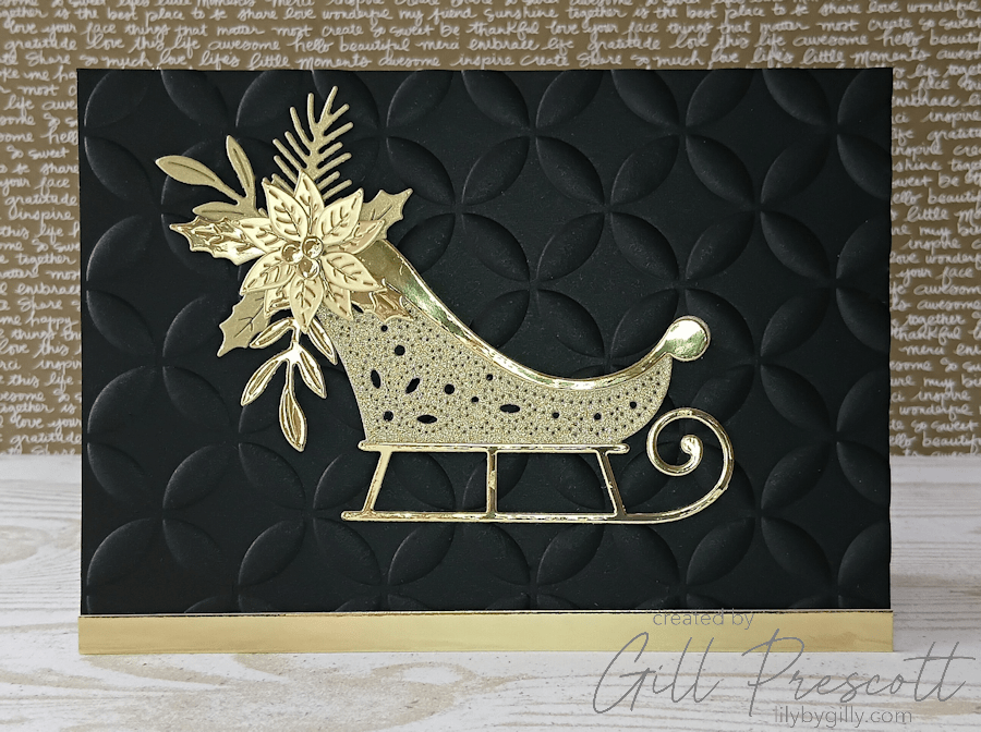
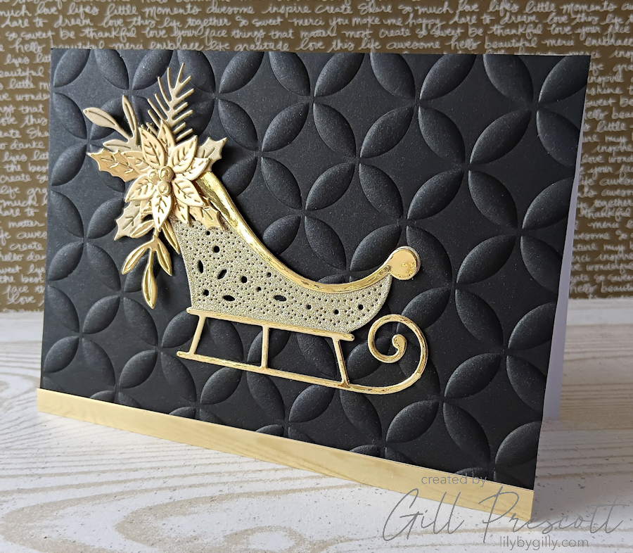
There’s something irresistibly classy about a black and gold colour palette, especially at Christmas. For this week’s colour challenge at 52 Christmas Card Throwdown, the brief was simple but bold: only black and gold. No neutrals, no extras – just high contrast, high impact festive style.
The Card Base & Background
I started with an A6 card base, keeping the size neat and perfect for posting. The main panel is black card, cut to A6 and embossed using the Woven 3D Embossing Folder from Spellbinders. This embossing folder adds beautiful depth and texture, and when paired with black cardstock it creates a rich, almost fabric-like background that feels instantly luxurious.
The Focal Image
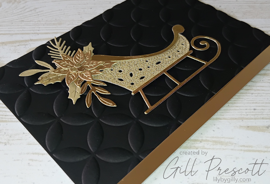
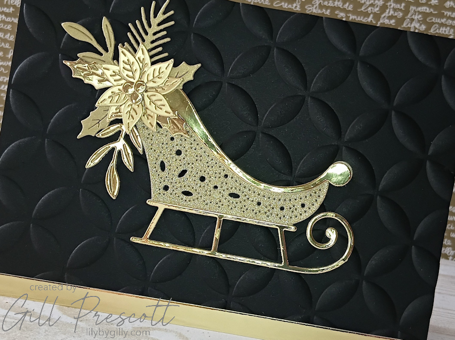
The focal point of the card is created using the Delivering Join Sleigh dies, cut from several different shades and finishes of gold cardstock, all by Spellbinders. Mixing gold tones is a great way to add interest while still sticking strictly to the colour challenge – matte, shiny, sparkly and textured golds all catch the light differently and add natural dimension. I absolutely love this gold card pack from Spellbinders, the colours are just beautiful and it has been one of my favourite things to create with. I’ve nearly used the whole pack now, so must place an order again soon!
The sleigh itself is adhered centrally on the card, making it the star of the design.
Poinsettia & Foliage Details
To one side of the sleigh, I arranged the poinsettia and foliage die cuts, also cut in gold cardstock. Keeping them offset rather than symmetrical adds movement and a more modern feel to the layout, while still maintaining balance across the card front. All those small pieces were great for using up lots of scraps too, which is always a good thing!

Finishing Touches
To ground the design, I added a strip of gold mirri card along the bottom edge of the card. This small detail helps anchor the sleigh visually and adds an extra hit of festive shine without overpowering the rest of the design.
Final Thoughts
This card proves that limiting your colour palette doesn’t mean limiting your creativity. Black provides drama and contrast, while gold brings warmth, elegance and that all-important Christmas sparkle. The combination of embossed texture, layered die cuts and reflective cardstock makes this a simple but striking Christmas card – perfect for a colour challenge and ideal for those who love a more sophisticated festive look.
A classic palette, timeless style, and lots of Christmas shine. Do come and join us this week over at 52 Christmas Card Throwdown – we’d love to see what you make.


love this card, the black and gold just works.
oh wow Gill, comme a chaque fois tu élèves le niveau de création, biz
Fabulous card Gill! It is amazing what you can create with just black and gold – they give such a dramatic contrast! Great to see you back in action – hope all is OK x
Mein erster Gedanke beim Anblick deiner Karte: schlichte Eleganz mit den tollen goldenen Stanzteilen! ELFi