

The 52 Christmas Card Throwdown always brings fresh inspiration, and this week’s colour challenge was the perfect excuse to create something elegant, wintery, and just a little bit whimsical. I opted for a soft and serene colour palette, blending cool greys with gentle pink accents to achieve a delicate, snowy scene. With a combination of stamping, die-cutting, and a touch of hand-cut detail, this card came together beautifully—let’s dive into how it was made!
Card Overview
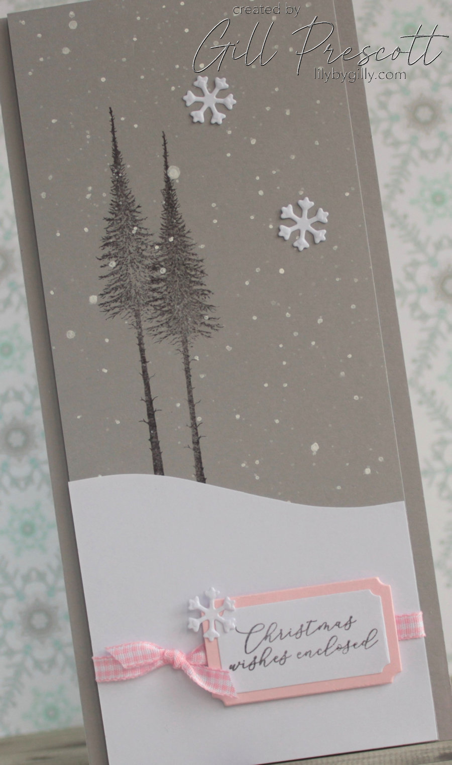
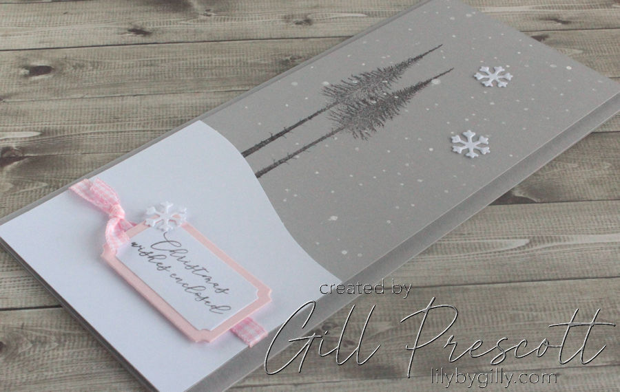
This card was designed with a DL size layout (tall and slim), perfect for showcasing a peaceful winter landscape. A monochromatic grey backdrop sets the scene, while white and pink elements add contrast and a subtle touch of warmth. The final details, including a soft pink gingham ribbon and intricate die-cut snowflakes, tie everything together in a refined yet cosy way.
Materials Used
- Smoky Slate Cardstock – for the base card and front panel.
- Lavinia Stamps Small Fairy Fir Tree – to create the winter scene.
- Basic Grey Ink (Stampin’ Up!) – for stamping the trees and sentiment.
- White Posca Pen – for adding snowfall details.
- White Cardstock – for the hand-cut snowy hill and sentiment panel.
- Spellbinders Envelope of Wonder Sentiments Set – for the greeting.
- Stampendous Make It Pop Up Dies – for the sentiment label.
- Pink Pirouette Cardstock – for layering behind the sentiment.
- Sue Wilson’s Creative Expressions Bold Snowflake Flurry Dies – for embellishing with die-cut snowflakes.
- Pink Gingham Ribbon – to add softness and texture.
Step 1: Creating the Base and Background Panel
The base card was cut from Smoky Slate cardstock to DL size, giving the card an elegant, elongated look. To create a seamless design, I used an offcut of the same cardstock for the front panel, maintaining a tone-on-tone effect.
For the background, I stamped the Small Fairy Fir Tree by Lavinia Stamps twice using Basic Grey ink, varying the height and placement to create the illusion of wintery trees. To add a snowfall effect, I splattered a White Posca Pen lightly across the panel, mimicking a gentle flurry of snowflakes.
Step 2: Adding the Snowy Hill
A piece of white cardstock was hand-cut into a soft, curved hill shape to sit at the base of the tree line. This added a sense of dimension and helped ground the stamped trees. I then adhered it to the bottom of the panel, ensuring it blended smoothly with the scene.
Step 3: Die-Cutting and Stamping the Sentiment
The sentiment, from the Spellbinders Envelope of Wonder Sentiments Set, was stamped in Basic Grey ink onto white cardstock. To give it a polished, layered look, I die-cut it using the Stampendous Make It Pop Up Dies and also cut a slightly larger label from Pink Pirouette cardstock. Stacking these together created a subtle contrast that softened the grey tones beautifully.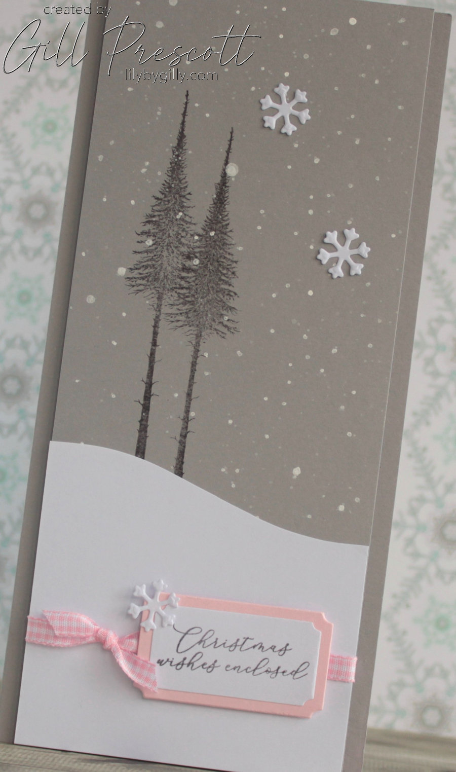
Step 4: Adding Die-Cut Snowflakes and Ribbon
To embellish the design, I die-cut three small snowflakes from Sue Wilson’s Bold Snowflake Flurry set and arranged them in a random pattern across the card. One was also placed on the corner of the sentiment label, creating a lovely visual link between the elements.
For a final touch of texture and charm, a length of pink gingham ribbon was tied around the bottom of the panel, towards the bottom of the snowy hill. The sentiment label was then adhered over the ribbon, ensuring everything was balanced and cohesive.

Step 5: Assembling the Card
With all the elements complete, the entire front panel was adhered to the centre of the Smoky Slate base card using foam adhesive, bringing the design together in a clean and elegant way. The result is a soft, wintry card with a modern yet cosy feel, perfect for spreading festive cheer.
Customising the Design
This card is a wonderful example of how colour choices can transform a Christmas card. The soft greys and pinks give a gentle, almost storybook-like quality, making it ideal for anyone who loves a more delicate winter aesthetic.
If you’d prefer a more traditional or masculine look, consider:
- Swapping Pink Pirouette for navy or deep red.
- Using a different focal image, such as a deer or a classic Christmas tree.
- Opting for silver ribbon instead of gingham for a sleek, icy finish.
Final Thoughts
This 52 Christmas Card Throwdown colour challenge was a joy to take part in, and I loved working with this subtle and elegant winter palette. The combination of stamping, die-cutting, hand-cut elements, and a touch of ribbon made for a card that’s both visually interesting and simple to recreate.
Are you joining this week’s challenge? I’d love to hear how you’ve interpreted the colour scheme—let me know in the comments! Happy crafting!

That’s fabulous! I love the contrast of the pink against the grey and white
oh wow Gill, elle est magnifique, j’aime ces grandes silhouettes et cette touche de rose qui met en valeur le sentiment. biz