

Hello, crafty friends!
I’m so excited to be back this week hosting another challenge for 52 Christmas Card Throwdown, and this time it’s a colour challenge! We’re stepping a little away from the traditional Christmas palette and getting bright and modern with red, lime green, and turquoise. These fresh, cheerful colours really pop together and give such a fun, contemporary twist to festive cardmaking.
Card Details
- Challenge theme: Colour – Red, Lime Green & Turquoise
- Card size: 6″ square
- Main products: Decorative Trees stamp set by Stampin’ Up, Perfect Plaid background stamp by Tim Holtz, 3D Flurry of Snowflakes embossing folder by Spellbinders
- Techniques: Stamping, embossing, die cutting, layering
Step 1: Creating the Base Layers
I began with a 6″ square base card in white cardstock, then embossed two panels of white card using the beautiful 3D Flurry of Snowflakes embossing folder by Spellbinders. These embossed pieces were adhered to either side of the card base, leaving a clean space in the middle for the focal panels.

Step 2: The Centre Panel
For the centre section, I used another piece of white cardstock, and stamped it with the Perfect Plaid Background stamp by Tim Holtz in Tempting Turquoise ink. The bold plaid adds a lovely texture and contrast to the snowflake panels on either side.
This piece was then popped up on foam adhesive to give a little dimension and shadow between the layers.

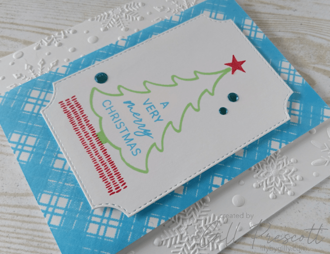
Step 3: The Focal Panel
The focal point of the card features the Decorative Trees stamp set by Stampin’ Up. I stamped the tree in Lucky Limeade ink, the sentiment in Tempting Turquoise, and the little star and decorative grounding strip in Real Red.
Once stamped, the panel was die cut using one of the shaped panel dies from the Branching Out die set by Stampin’ Up, which gave lovely curved corners and stitching detail. The shaped panel was then adhered to the centre of the card using foam adhesive to make it stand out.
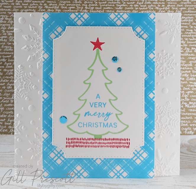
Step 4: Finishing Touches
To finish, I added a sprinkling of turquoise flat sequins by Spellbinders, just enough to catch the light and tie all the colours together.
Final Thoughts
I love how this card turned out – the bright, unexpected colours bring such a fresh energy to a classic Christmas design. It’s a lovely reminder that festive cards don’t always need to be traditional to feel joyful and seasonal.
I can’t wait to see how you interpret this Red, Lime Green, and Turquoise colour challenge! Don’t forget to share your creations with us at 52 Christmas Card Throwdown – I’m really enjoying seeing everyone’s take on the challenges this month.
Happy crafting, and see you next week for another festive challenge!


If Burberry did Christmas cards, it would look like this…classy, uncluttered, iconic!
Thank you! I’m so glad you like it! Gill x
Love those colours! Great card
c’est une merveille de fraicheur Gill, ces couleurs me rappellent la foret… biz
Mir gefällt die Umsetzung der Challenge ausgesprochen gut! Liebe Grüße