
This week’s 52 Christmas Card Throwdown is a colour challenge featuring the timeless and elegant pairing of kraft and white. I absolutely love this combination—it’s soft, natural, and perfect for creating a subtle, wintry feel without relying on traditional festive colours.
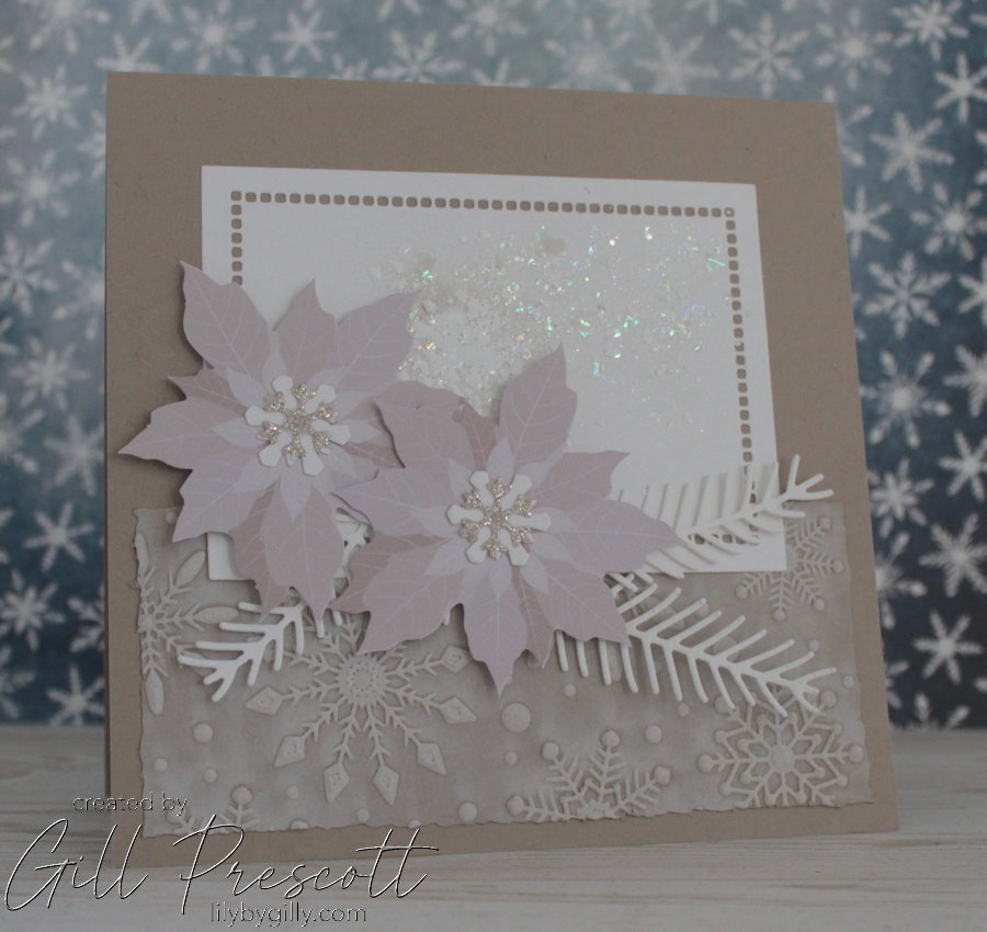
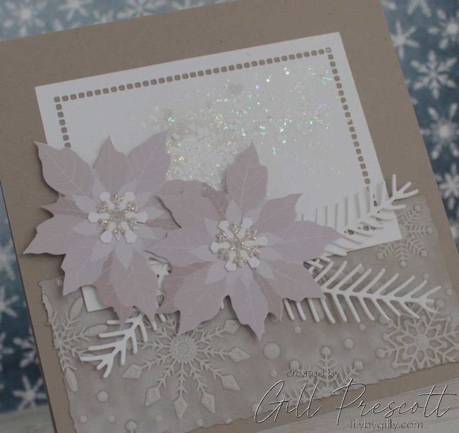
For my take on the challenge, I created a 6-inch square Christmas card using Crumb Cake cardstock, layered textures, and delicate die-cuts to bring a quiet, snowy mood to life. This card is rich in dimension and detail, even though it uses only two colours.
Let’s dive into how I brought this soft and snowy card together.
Card Overview
-
Base: 6″ square card in Crumb Cake (kraft) cardstock
-
Texture: Snowflake embossed panel with white ink highlights
-
Feature panel: White die-cut rectangle, heat embossed with shimmer
-
Focal point: Kraft poinsettias with white pine and snowflake details
-
Finishing touches: Deckled edges, layered textures, and soft sparkle

Materials Used
-
Crumb Cake Cardstock (Stampin’ Up!) – for the base and embossed panel
-
White Cardstock – for die-cut accents and the feature panel
-
Spellbinders Flurry of Snowflakes 3D Embossing Folder – for the snowflake texture
-
White Pigment Ink – to highlight the raised snowflakes
-
Tim Holtz Deckle Edge Trimmer – for a rustic finish
-
Spellbinders Hemstitch Rectangle Dies – for the central white panel
-
Stampendous Encrusted Jewel Kit – for random white sparkle embossing
-
Kraft Poinsettia Die-Cuts – the main floral elements
-
White Pine Branch Die-Cuts – tucked behind the flowers
-
Tim Holtz Snowflake Die-Cuts – layered at the centre of each poinsettia
-
Tiny White Glitter Snowflakes – for a hint of sparkle
-
Dimensional Adhesive – to pop up the flowers and add depth
Step 1: Building the Base
I began with a 6″ square card base using Crumb Cake cardstock, folded at the top for a portrait orientation.
To add texture and interest to the bottom portion, I took another piece of Crumb Cake cardstock and ran it through the Spellbinders Flurry of Snowflakes 3D Embossing Folder. To make the embossed snowflakes stand out, I lightly swiped white pigment ink across the raised areas—it really brought those beautiful snowflakes to life!
The panel edges were then trimmed using the Tim Holtz Deckle Edge Cutter, giving it a soft, slightly distressed finish, and the piece was adhered to the bottom edge of the card front.
Step 2: Creating the Focal Panel
Next, I die-cut a rectangle of white cardstock using the Spellbinders Hemstitch Rectangle die, which added a beautiful pierced border detail. To give it a festive shimmer, I applied random patches of embossing from the Stampendous Encrusted Jewel Kit. I love the mix of textures and sparkle in this kit—it gave the panel just the right amount of interest without being overpowering.
This panel was adhered centrally on the card, overlapping the embossed kraft section at the bottom to help bring the design together.

Step 3: Layering the Florals
For the focal point, I used two kraft-coloured poinsettia die-cuts by Spellbinders. These were adhered using dimensional adhesive to lift them slightly from the background and add depth.
To complement the poinsettias, I tucked in pine branch die-cuts by Stampin’ Up in crisp white cardstock, which added some lovely contrast and movement. In the centre of each flower, I placed a white die-cut snowflake by Tim Holtz, and topped them with tiny white glitter snowflakes for a frosty sparkle.

Finishing Touches
I decided to leave off a sentiment on this card, letting the textural elements and neutral colour palette speak for themselves. The combination of natural kraft tones with snowy whites creates a serene, peaceful design that feels both rustic and refined.

Customisation Ideas
If you’d like to adapt this card, here are a few ideas:
-
Add a simple stamped sentiment in white embossing in one corner
-
Use vellum pine branches for a softer layered look
-
Swap the poinsettias for snowflakes or a stag silhouette for a different focal point
Final Thoughts
I really enjoyed the challenge of working within a limited colour palette this week. Using just kraft and white encouraged me to focus more on texture, shape, and layering, and I love the calm, wintry result.
Are you joining in this week’s 52CCT colour challenge? I’d love to hear how you interpreted kraft and white—tag me if you share your make online!
Happy festive crafting!

Oh wow Gill! ce joli marron glacé très chic et cette magnifique fleur, quel beau mariage, biz