Hello friends.
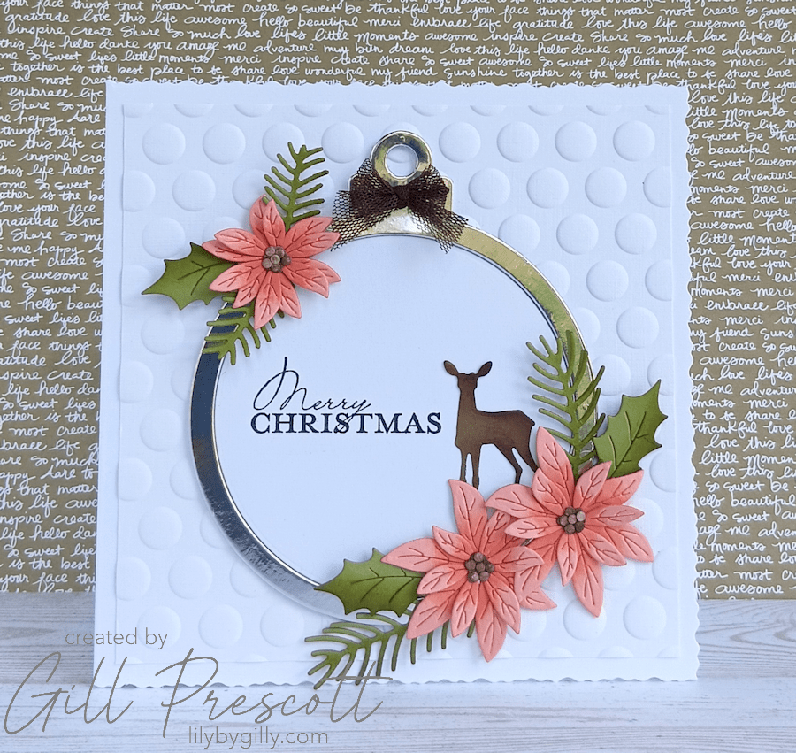
It’s time for another 52 Christmas Card Throwdown challenge, and this week we’re playing with a rather unusual festive colour combination — apricot, moss green and brown. I have to admit, these aren’t colours I’d naturally reach for when making a Christmas card, but that’s exactly why I love colour challenges. They encourage you to step outside your comfort zone and see familiar supplies in a completely different way.
As I have rather a lot of Stampin’ Up! cardstock and inks in my craft room, my first task was to discover which of their colours most closely matched apricot. After a little searching, I found that Crisp Cantaloupe was the closest match, and it worked beautifully alongside Old Olive and Chocolate Chip.
Here’s how I made my Design Team card.
Materials Used
- Cardstock: White linen, Silver Mirri, Crisp Cantaloupe, Old Olive, Soft Suede and Chocolate Chip
- Dies: Bauble Overlay Die, Craft Addiction UK; Holiday Blooms, Spellbinders; Winter Wonderland, Tim Holtz/Sizzix
- Embossing Folder: Spellbinders 3D Puffy Dot
- Ribbon: Early Espresso Net Ribbon (Stampin’ Up!)
- Sentiment Stamp: Contempo Christmas, Stampin’ Up!
- Inks: Crisp Cantaloupe, Old Olive, Chocolate Chip and Black
- Adhesives: Liquid glue and Glue Dots
- Card Base: 5¾” square white deckle-edged card
Step 1: Create the Background
I began with a 5¾” square white deckle-edged card base, which gives the finished card a lovely soft, handmade feel.
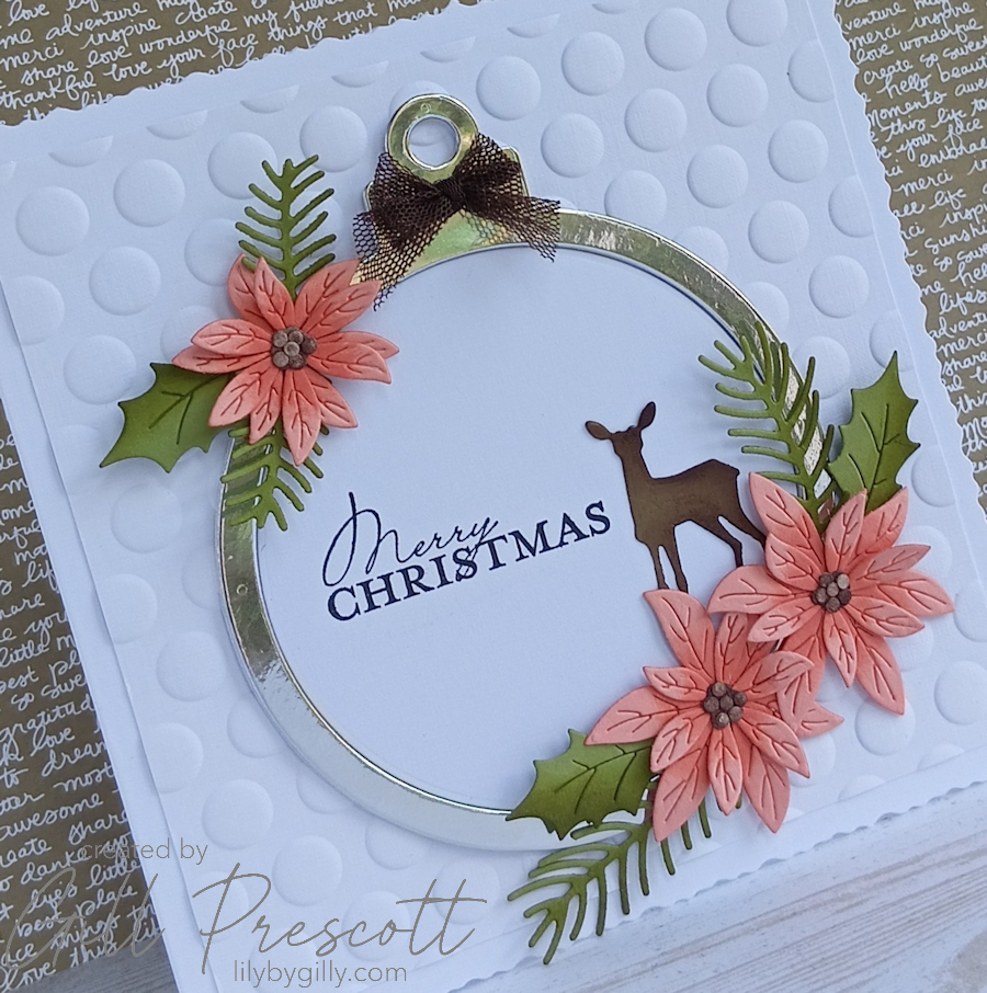
To add texture without overwhelming the design, I embossed a white panel using the Spellbinders Puffy Dotty 3D Embossing Folder before adhering it to the card front. I love the subtle pattern this folder creates — it reminds me of snow and provides the perfect backdrop for the focal elements.
Step 2: Die Cut the Bauble
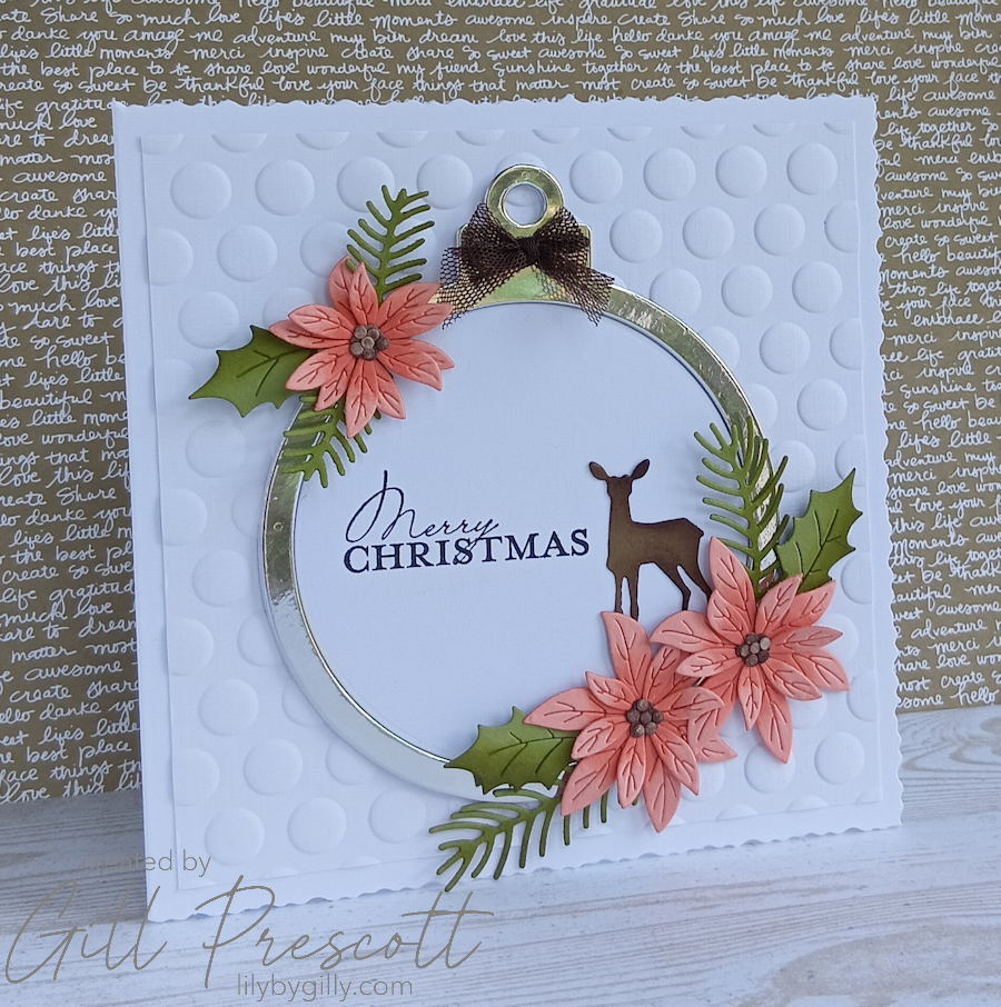
For the focal point, I used the Craft Addiction UK bauble overlay die.
I die cut the bauble from white cardstock twice and once in silver mirri and adhered together to give the frame some strength. I also used the centre circle to have a flat surface to stamp on.
Step 3: Add the Floral Details
Using the Holiday Blooms dies by Spellbinders, I created festive foliage and flowers in the challenge colours. The combination of warm apricot tones, earthy greens and rich brown creates a sophisticated colour palette that feels both modern and festive.
Before assembling them, I lightly inked the die-cut pieces using co-ordinating Crisp Cantaloupe, Old Olive and Chocolate Chip inks. This simple step adds depth and dimension, helping each die cut stand out beautifully. I also added a small die cut deer in soft suede and inked with chocolate chip.
The finished arrangement was tucked around the bauble, creating a balanced focal point.
Step 4: Add the Ribbon
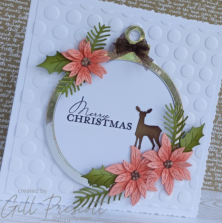
I found a length of Early Espresso Net Ribbon from Stampin’ Up! which I’ve had in my stash for many years and thought it would go perfectly. I tied a fork bow and secured it to the top of the bauble with a Glue Dot.
I love the texture this ribbon brings to the design. Its open weave adds interest while complementing the earthy tones of the challenge palette perfectly.

Step 5: Add the Sentiment
For the greeting, I chose a simple festive sentiment from Stampin’ Up!, stamped in black ink to the left of the inside circle of the bauble to give a crisp finish.
Keeping the sentiment simple allows the die-cut elements to remain the main feature of the card.
Step 6: Assemble the Card
With all the individual elements prepared, it was simply a case of arranging everything until I was happy with the composition before adhering the pieces using liquid glue.
Taking a few moments to audition the layout before committing with adhesive always helps achieve a balanced finished design.
Final Thoughts
I thoroughly enjoyed this challenge. It’s amazing how a colour combination that initially feels a little unusual can come together so beautifully once you start creating.
The soft warmth of Crisp Cantaloupe, combined with the richness of Old Olive and Chocolate Chip, gives this Christmas card a wonderfully elegant, almost classic feel. Add in the sparkle of the silver mirri card and plenty of texture from the embossed background, and you have a festive card that’s a little different from the traditional red and green.
If you’ve never entered a colour challenge before, I’d really encourage you to give this one a try. You might just discover a new favourite colour combination!
Don’t forget to pop over to 52 Christmas Card Throwdown to see the fabulous inspiration from the rest of the Design Team, and we’d love to see your interpretation of this week’s colours.
Enjoy your weekend.


Love the colours, the space and of course, the stag… great composition.
elle est splendide Gill, quelle élégance, biz
Absolutely beautiful Gill!